how to art direct a client who already designs with AI
Your clients already make their own flyers with AI. Here's how to be of service - building a system and template so their content is just as fast, but on-brand.

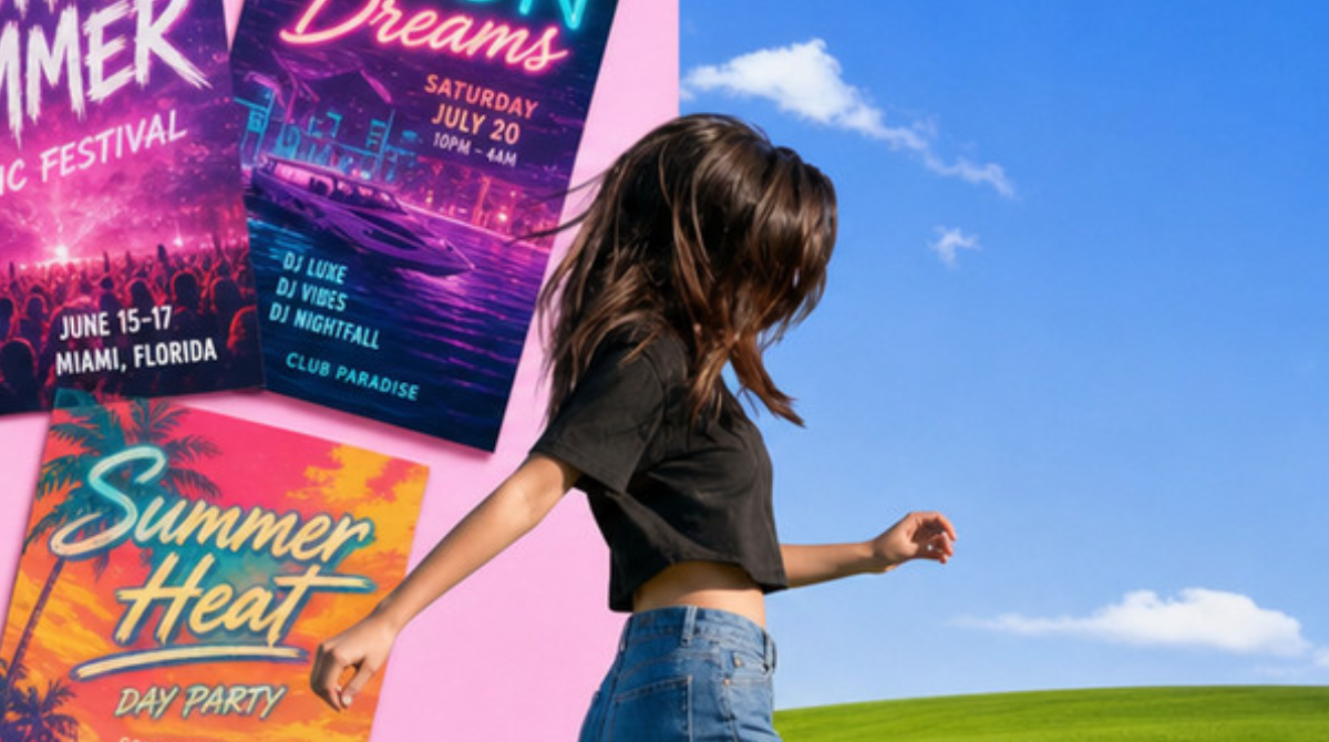
Small brands are making their own flyers with AI now. The local events account, the coffee shop, yoga studios - they're all typing a prompt and getting a usable poster in 30 seconds, no designer required. And who can blame them, it's fast, cheap and easy.
If you're a designer it's kind of scary. BUT it could also be an opportunity. Because people making AI flyers don't have a brand and they also don't have time. They have the output but they don't have a system. And that gap is exactly where we get to be useful.
I ran a small experiment on a westside ig I follow, GoSeeDo, hyperlocal "go see it, go do it" events, with flyers all made with AI. A small test to see how a designer could become of service to a client who's already DIY-ing it.
why goseedo specifically needs this
AI designs used to make you stand out. Now they make you blend in. Every local account, every coffee shop is running the same models with the same default settings, which means the feed is filling up with the same vaguely tropical day club look. If goseedo's flyer looks like everyone else's AI flyer, the brand is lost.
goseedo is hyperlocal, targeting 30ish year olds in LA. This is one of the most design literate audiences on the planet - they work in entertainment and tech and creative, they've seen a million decks, they can smell a default AI image from three miles away. They don't consciously think "bad branding," they just keep scrolling.
So the goal isn't "prettier flyers", it's a thumb stop. A structure so specific that a local sees the the photo and the font and knows it's them before they read a single word. In a sea of AI posters, the most radical thing you can do is look like yourself.
the client doesn't need you to make the flyers. they need you to make the rules.
Old model: client hands you a brief, you make the thing, you hand it back, repeat forever and bill hourly. But it doesn't scale and it kind of resents the AI.
New model: you build them a system - and then you teach the AI to obey it. You're not the person making every flyer anymore. The client keeps their speed but now everything they make comes out looking like them instead of looking like a pink & beige gradient party.
The offer has to be: I'll make it just as easy as it already is but BRANDED.
1. review the existing feed and find what's already theirs
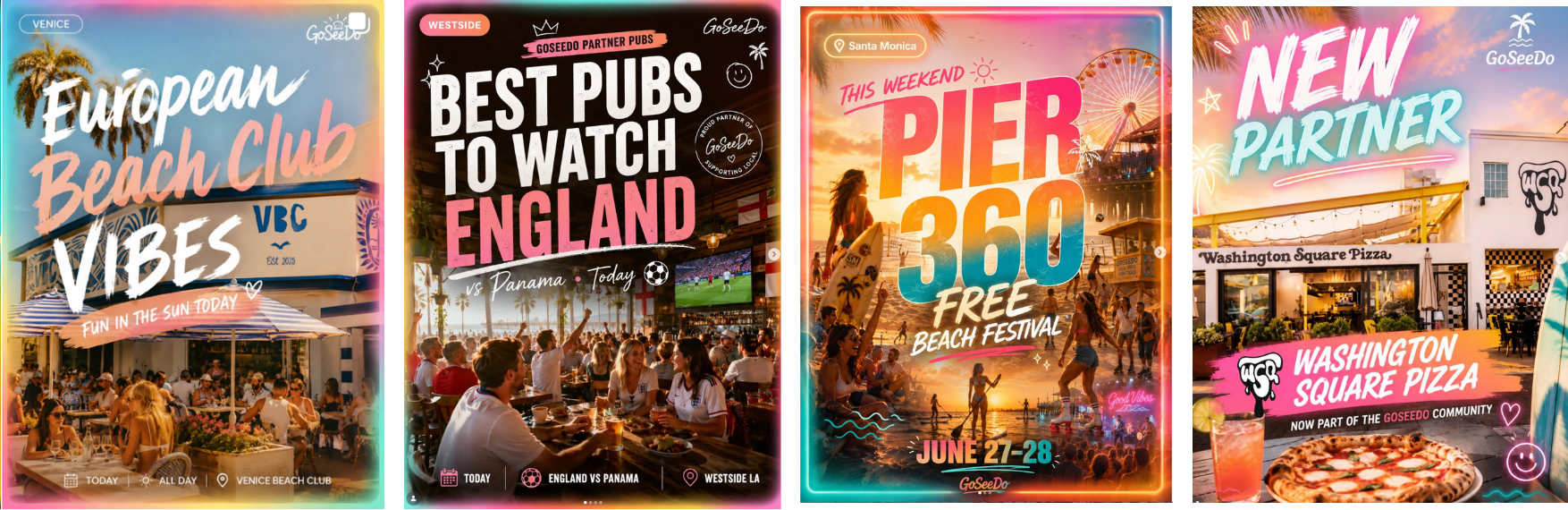
Before changing anything, I looked at what goseedo was already doing right. Their turquoise, their cute logo and each post had a pretty consistent structure.
2. cut stuff out
The feed had a new look every day, neon rainbow borders, three brush fonts per poster, glowing "TODAY!" bubbles, hearts, pink on absolutely everything and a different logo each time. So I removed the neon, the font soup, the gradients. To be fair, gradients are not bad, it's just that they have now become an automatic tell that you are using AI :(
3. lock a tiny brand guide
This is just an example of a system. goseedo has lots of pinks in their current branding so I picked a different color palette for contrast.
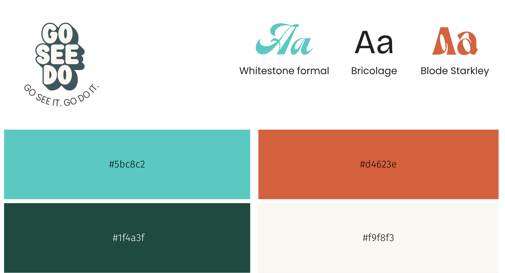
- One palette, rotating. Each post picks one as its card color.
- Display font + one label font. Don't let the AI use 12 typefaces.
- Photo frame. Every image lives inside a photo frame. The photo can change every time but the brand never does.
- One locked logo + tags. Logo top left, label tags for the vendor in this case since the client is featuring many vendors as part of their referral program.
4. use the vendor's real photos
Instead of an AI photo of a real business, you use the vendors actual photo. The vendor probably has the photography already.
AI builds the frame and the vendor's real photo fills the window.

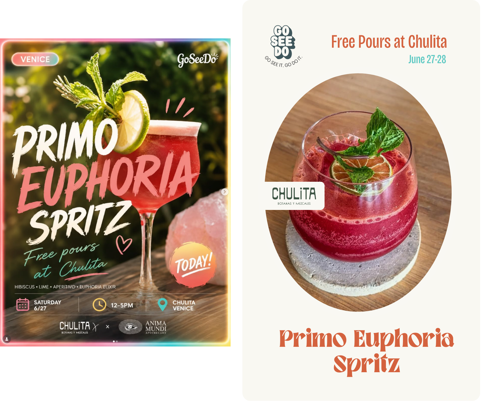
5. feed the guide back to the AI
I took one of their real flyers - the Primo Euphoria Spritz - and re-prompted it through the system: beige card, logo top left, cocktail inside the frame, one headline, partner lockup on the frame.
I did have to find the image of the cocktail because I didn't want AI to generate it, but it placed the rest of the content pretty well, including the vendors logo which was surprising. This is nano-banana.
whole thing or just a part
This is the part that decides your workflow: when the AI generates the whole asset, it renders the text too :( Text is where AI is still just UGH. It'll misspell, warp, add things, and it won't reproduce a specific licensed font. In my tests it actually nailed the design, but you can't bank on that every time. The template I am using in this test is simple, but yours might be more complex.
two options:
- Fully generated by AI, locked into the style guide system with the understanding that some things might be "finessed" by the AI. But this will get better over time as AI progresses.
- The frame is AI generated with all the details, you create a Figma or Canva to drop in the photos. The AI gets you 90% of the way there, you just make the final edits.
the actual product you're selling
You're no longer designing the assets. You're selling a small repeatable machine: a four-color palette, a font pairing, one photo frame, a locked logo, and a prompt + template they reuse for every post. The client keeps the speed AI gave them. You give them the one thing AI can't: a point of view that stays consistent.